Via
Daring Fireball (which uses a nice, simple icon in its design), Craig Hockenberry has a
post up at Iconfactory comparing
raster (pixel-based) versus
vector (shape-based) images in the context of the needs of software developers. He makes the argument that raster is the way to go for a few reasons, but the argument that caught my eye was that vector images are so much larger than rasters, which brings my own understanding of the world completely into question.
Size: Today's photorealistic icons require a lot of vectors. More than you may realize. Unless you're dealing with simple line art, effects such as gradients, shadows, and highlights result in enormous files. As an example, compare this 512×512 pixel PNG file of the CandyBar icon with a PDF file containing the same image. The PNG file is about 100 KB while its PDF counterpart is a whopping 3 MB. Consider a five icon toolbar with PNG files versus a toolbar with PDF files—500 KB versus 15 MB. Your ISP will love you and your PDF icons!
Which may be true for icons like Hockenberry's example
Candybar icon. The icon is so full of blends and dropshadows that it looks more like a stylized 3D rendering than a 2D illustration. Don't blame Iconfactory, though - that's what the vast majority of icons in modern operating systems and software look like. Hockenberry quite usefully links to the PNG and PDF files of the same image, so it's time to download a vector illustration that's about the size of a three-minute MP3.
Looking into the icon PDF
Call me old fashioned, but 3 MB does not sound like the proper size of a vector illustration, no matter how photorealistic. Take a second to imagine using this icon in a downloadable PDF of your instruction manual, on every page, for however many pages. You'd run into some problems fast.
I opened up the PDF in Acrobat to see what was going on. First, under Document Properties we learn that the file was made with Adobe Illustrator CS3, remarkable not only in that the software
hasn't been released yet, but also because in my experience, various overhead in Illustrator can result in much larger files.
As you may know, a PDF file can contain either raster or vector elements, or a combination of both. Let's see what this file is made of. There's an underutilized but useful tool in Acrobat under Advanced -> PDF Optimizer -> Audit Space Usage (and I notice that Christopher Lloyd, the blogger and not the actor,
has done the same thing, but for some reason I don't quite understand to a different file which he saved out). When I ran the audit on the Candybar file, here were the results:
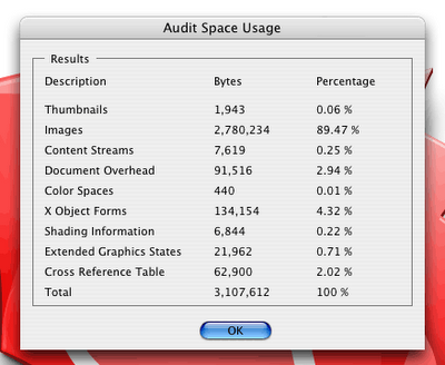
At least 89.47% of this PDF is comprised of raster graphics. Vector graphics are listed primarily under the "content streams" category, but also show up in "shading information" and some of the other categories depending on their complexity. But here we have a file that is arguably far more raster than vector. Some of the raster objects may have been complex vector elements in Illustrator, but most of these rasters are probably raster effects that Illustrator renders on screen and then to the PDF when it's saved out.
To learn a little more, I opened the PDF up in Illustrator CS2 to see its underlying structure. Here I have the Links pallet open to demonstrate the number of images in the document:
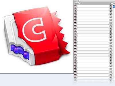
I counted over 100 images in the PDF, from the large drop shadow behind the candy bar, to tiny round purple blobs, to graphics that can't be seen because they're behind the candy wrapper. Apparently, Illustrator is even ignoring some of the images - Stephen Deken found
281 rasterized images using command line tools that are out of my league.
Are all these images really necessary? With just a couple minutes of work I was able to remove the non-essential images and come up with a 248 KB PDF that looks almost (but not quite) as good as the original and opens much faster in Preview than the 3 MB version.
Now 248 KB is still pretty big, and with some redesign we could get it to be a lot smaller. You could squeeze a simple flat color illustration, or one with basic blends, down to 10 KB, and those 10 kilobytes will look great at any resolution and scale factor. But a modern icon designer would probably find and icon like that completely unlickable.
Modern icon design - more raster than vector to begin with
Just look at the dock in Mac OS X, and you see a world of glassy drop shadowed lickable icons. These have become common on the Mac over the past few years, and with Microsoft finally catching up with a new Windows interface the world will only get more lickable. These icons are so complex that it may very well be impossible to create vector-based resolution-independent versions that work well with modern computer hardware and internet connections.
But this isn't the fault of the inherent shortcomings of vector graphics. This is due in part to the limitations of the PDF format, which for PDF interpreters in current use requires that elements like drop shadows and complex blends and gradient meshes become raster graphics instead of vector data. When we introduce the problems of raster graphics into our ultra-high-resolution vector graphics, that's when we get 3 MB icons.
The other problems with vectors in resolution independence that Hockenberry mentions - speed and appearance (when they're scaled down) - are mitigated by reducing our reliance on raster graphics in icon design. Speed will be much less of an issue with simpler icons, and icons with less bells and whistles are naturally clearer at smaller sizes.
Hockenberry links to a
post by Sven-S. Porst which discusses icon resolution. Porst has a point that pixel-by-pixel editing can bring out a lot of detail that scaled-down vector graphics can't, but I wonder how many modern icon designers really give the ultra-small version of their icon much thought. I don't see much evidence of that on OS X. Porst has hope that icons will end up much simpler if vector graphics are part of the process in icon design, and I second that. Unfortunately, thanks to all of Illustrator's features, vector graphics are very rarely just vector graphics.
And wait - we're forgetting how commonplace vectors are
There's one part of computer interface graphics that have just about completely transitioned over to vectors. Remember the days of bitmapped fonts? Long gone, replaced by scalable vector fonts. The same data is used whether you view your font on screen or on a sheet of paper. Deken,
in his post, makes a point about how efficiently fonts are rendered quite well:
I suspect that just before you read this, your computer rasterized every letter in this essay using a vector-based font.
The transition to vector wasn't without its bumps. At small sizes, raster fonts looked much better than vector, so technologies like font hinting stepped in to improve readability of small vector fonts. And with sub-pixel rendering on LCD screens, new uses have been discovered for vectors that the original inventors and designers never thought of.
And thank goodness for the restrictions in place for vector font graphics. I can only begin to imagine the ugly multi-colored drop shadowed fonts we'd be designing if it wasn't for the single-color vector limitations that have long been in place.
So when you're hovering over your OS X raster dock icons and you see the name of your program pop up with a nice drop shadow behind it, know that at least part of what you're seeing is rasterized vector data.
Some current situations where vector computer interface graphics would rock
- Users zoom in on interface elements for accessibility reasons; these would scale up nicely if they were vectors
- Screenshots with live vector data would be useful in print media, where screenshots often look pixelated
- Screencasts and videos that show details in interfaces can benefit from vector images
These situations are limited, but I already am quite happy that at least the text part of computer graphics are vector-based. When I'm making videos that discuss web sites I find myself using an application like Adobe Acrobat and its web capture feature rather than a web browser to render the text of a web site because the vector text in video looks way clearer than a raster screenshot.
Some obscure uses are probably not enough for software developers to use vector icon graphics as opposed to raster, but I imagine as time goes by new needs for scalable computer interface graphics will arise. I don't think it will matter, for most purposes, whether these needs are filled with vector images or higher resolution raster images. Like raster vs. vector in print media, the choice will largely be according to the nature of the image or text.
And in conclusion
Icon designers once lived in a world of restrictions. Limited colors and limited sizes resulted in clunky bitmapped images that seemed like more of an afterthought. These icons, though, were at least descriptive when you had a large set of them on screen, and their file sizes were nice and small.
Modern hardware and operating systems have resulted in fancier icons, but at the cost of usability. Our computer screens have only gotten a couple inches bigger, on average, over the past couple decades. But when scaled down to small sizes, many modern icons look less like icons and more like colorful blurs with drop shadows on them. Some tricks - like the OS X dock's "Magnification" feature - help users figure out what they're clicking on, but it's hard to come up with a reason why users are happier with your
shiny blue icon than they were with clearer icons from 5 or 10 years ago.
Some forms of design still have restrictions that may help the designer in the long run. Logo design is often constrained by the need to use less colors to save money on print runs. This may result in a cleaner looking, more professional logo that stands up well over time. Computer icon designers don't have the same kind of restrictions, and that may not be a good thing.
Support for vector graphics in computer user interfaces is a really neat idea, and we can imagine a whole slew of limited situations in the present and future where one could find them useful. In fact, we're already finding new reasons to love vector-based fonts.
But icons aren't ready to be displayed as vectors, in part because often by their very nature they are composed of raster images, in part because higher resolution raster images work just fine in most cases, in part because there's really no file format ready to meet our needs, and in part because a few more years will have to pass before icon designers decide that there's a bitter taste to all these lickable photorealistic icons.


